
Thursday, May 26, 2016
Scratch Board
Thursday, May 19, 2016
Self Portrait

I chose to do an expressive portrait for this project. When I was thinking about ideas I thought what would make an expressive face and I starting thinking about my greatest fear which is being strangled. Every person is different with different likes, dislikes and fears. My portrait shows who I am underneath and what my greatest fear is.
When I was taking reference pictures I tried having my brother strangle me but my facial expressions didn't match what I felt inside. I ended up using three different pictures and using different facial features from each. One picture I used my eyes and another I used my mouth and the last I used my brothers hand that was strangling me.
It took me a while to get my eyes and facial features drawn correctly and proportionally. My mouth could have been drawn a bit bigger but other than that I think I did a good job and showing the scared and trapped facial expression that I feel if being strangled. The portrait also looks a lot like myself so I am happy that I was able to draw me and not some random individual. I used several pencils and a blending stump to draw this.
I chose to do an expressive portrait because I have always liked realistic drawings instead of things that look made up. I think the best part of this portrait is my eyes. I took a lot of time putting in value and making them look like my own. I also think the hand is very well drawn and looks like what I wanted it to.
This is a very original piece and I am very happy by how it turned out.
Tuesday, May 3, 2016
Expressive Portrait Practice

This was my very first attempt in class drawing a face.


I did these two drawings after watching videos in class and learning about the proper way to draw facial features.

This was my face after I had learned about how to draw one correctly.
Opacity


I spent a lot of my time on this piece. I used every bit of class time to finish it and make it look good. I think the way I positioned the marshmallows and chocolate and graham crackers shows a story. I think that the ingredients being placed on a table was a good choice. I used a purple to show the shadows in the marshmallows so I didn't have to use black and for the reflection on the Hershey bar I used a blue color. I tried using colors that I didn't necessarily see in the picture I was drawing. For the two Hershey pieces at the bottom I used a pink color instead of straight brown and I think the colors really bring this together. The shadows on the table made by the marshmallows and the pieces of Hershey chocolate really help the drawing look more realistic. The dark color I used in the background helped make the table and ingredients stand out.
I used prisma color and if I hadn't used them before I don't think this drawing would have turned out how it did. When you use prisma you can't just go at it. You have to layer colors and take your time. I think the fact that I didn't rush and I used all my time instead of procrastinating made this piece a success. A problem I had while drawing was making the marshmallows inside the bag, LOOK like they were inside the bag. I ended up using a gray color for the marshmallows inside to show the bag was see through. It was also difficult trying to draw the proportions right, but I think I did a pretty good job.
Monday, March 21, 2016
Chocolate Progression

Here is my progression project. I used a piece of chocolate candy and slowly unwrapped it and then ate a bite at the end. Value in this project is what gives it its shape and make it look like a wrapper. I think I did a pretty good job with the wrapper and showing the little bends in it that make it look like one. That's why it was important to have clean crisp edges in my wrapper. I had trouble in the beginning figuring out where the dark values needed to be because I had to imagine where they would be instead of seeing it since the chocolate is so dark as it is. While I was doing the project I couldn't really see the progression but now looking back at it, I can see the different phases it went through and I think it looks really cool. The way that I saw the texture is important because it's how I ended up drawing the piece. If I didn't see the different values and edges it wouldn't look the same as the piece of chocolate I was drawing. If I did this project again I would try and slow down when it comes to shading the chocolate because like I said before it caused me the most trouble so I caught myself kind of rushing through that part of it. I'd also try harder in the last part of it and making the piece of chocolate look the same size as the other progression shots.
Smarties

This drawing was done with pastel chalk. This piece shows opacity and how you can make something look see-through. With chalk I always find myself going fast instead of taking my time. If I did this project again, I'd probably try going a little slower. The twisty things at the ends were the most troublesome because I didn't know how to incorporate the red color and make it look realistic. I think I did a pretty good job with it though. As a whole I enjoy this piece a lot.
Thursday, March 17, 2016
Value In Eggs

This drawing was done with pastel chalk. We were instructed to take a picture of two or more eggs with dramatic lighting and then told to draw the values with color. This was an introduction to the chalk medium but also a way to figure out how to blend and show value using color instead of just black and white. It launched us into the next project we were to do.
Colored Pencil Candy

The lollipop I chose to draw was the Fruit Punch flavored. This was done with colored pencil. Instead of making the wrapper white like how it was and how everyone else did it, I chose to challenge myself and made it a blue color using a darker blue and purple to show the value. It took me a while to finish because it was really hard for me to figure out what color to put where and how to make it actually look like a wrapper. It was difficult but the end result isn't half as bad as I had expected.
Thursday, March 3, 2016
Still Life


Monday, February 15, 2016
Final Fabric Drawing

I used several ranges of white value in this fabric drawing. You can see in some places there is intense white and other places if fades out and where it is red that is where the dark values are. My practice studies for value of the sheet helped in figuring out which medium I wanted to use but also how I could bring the fabric to life just by the pressure I used with my white pencil. When I blended my pencil it created a whimsical feeling in the fabric. Blending and transitions helped bring my fabric to life and make it look more realistic. Since I saw the fabrics texture as being smooth, it ended up look smooth in my piece. The way I see the fabric in my head is the way it came out on the paper. I think if I recreated my piece, I would spend a little more time on the right side of the fabric and blending more into a softer white like I did on the left side to make it match. I would also add some more folds and creases.
Friday, February 5, 2016
Fabric Value Study

Before we started our final fabric drawing piece we had to do three different studies using different materials so see which one we wanted to use for the final. The very top sketch is just using pencil. The one below it is using black charcoal and to the left is using white prisma color on red paper. I have done a lot of drawings with charcoal and pencil so I decided to do my final drawing using red paper and white like the sketch on the left.
Ribbon Value Drawing

I drew the top ribbon using white charcoal and the bottom ribbon was done with white prisma colors. I enjoyed the prisma colors a lot because it was easier for me to blend the different values and them come together better.
Shape Shading

Here are two examples of some shape shading we practiced in class. The top I drew regularly and with a pencil while the bottom I drew with vine charcoal and compressed charcoal to show value.

Tuesday, February 2, 2016
Practice/Final Contour Line Drawing

This was my practice.

This is my final contour line drawing of the art room. I used a fluid line in this drawing, never picking up the pen. I think you can tell it was a fluid line by the curves you can see in it and how nothing looks sketchy. The practice studies really helped me create this piece because it jogged my memory on how to draw while not always looking at the piece of paper your drawing on. You just look at the thing your drawing and the rest comes together. You can tell that the drawing isn't like an outline because while you are drawing you are showing the details. You can really tell in the figures I drew that detail in the jacket was done without simply outlining the body but putting details in like creases in the sweatshirt, while I was drawing it. I needed to understand what a continuous line was to be successful in capturing the room. I also need to know that there are different widths of lines that can make something look darker and show more depth in the drawing. Also perspective played a huge role in the success of the drawing. I learned from this drawing that it is very hard to not lift your pen from the paper and just going with the flow. If I did this drawing again, I would try to fix the proportions on some of the objects I drew as well as make the ceiling look more realistic. I would also probably try to draw more figures because I liked how they turned out in this one.
Contour Lines
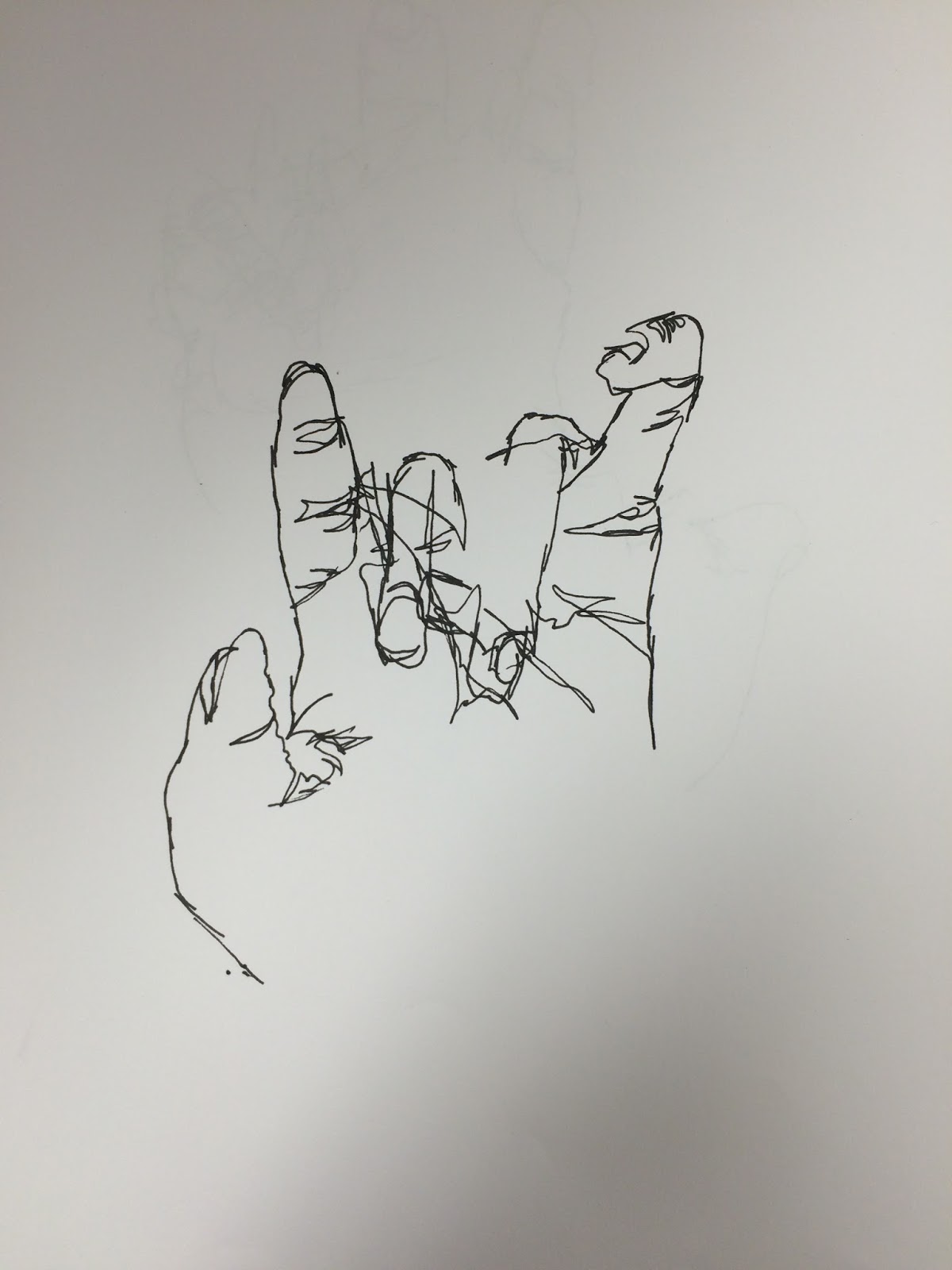
This is a blind contour drawing of my hand. Contour drawings are when the artist draws something with a continuous line, never picking up their pen or pencil. This drawing was also blind, which means I was not allowed to look at the paper as I drew. I could only look at my hand and try to imagine the drawing on the paper.

This is modified where I was able to look at the paper while I drew. Again, it is a continuous line as I never picked my pen up from the paper.

This is another modified contour drawing of a backpack.
First Day

Subscribe to:
Posts (Atom)