Thursday, May 26, 2016
Scratch Board
Thursday, May 19, 2016
Self Portrait
I chose to do an expressive portrait for this project. When I was thinking about ideas I thought what would make an expressive face and I starting thinking about my greatest fear which is being strangled. Every person is different with different likes, dislikes and fears. My portrait shows who I am underneath and what my greatest fear is.
When I was taking reference pictures I tried having my brother strangle me but my facial expressions didn't match what I felt inside. I ended up using three different pictures and using different facial features from each. One picture I used my eyes and another I used my mouth and the last I used my brothers hand that was strangling me.
It took me a while to get my eyes and facial features drawn correctly and proportionally. My mouth could have been drawn a bit bigger but other than that I think I did a good job and showing the scared and trapped facial expression that I feel if being strangled. The portrait also looks a lot like myself so I am happy that I was able to draw me and not some random individual. I used several pencils and a blending stump to draw this.
I chose to do an expressive portrait because I have always liked realistic drawings instead of things that look made up. I think the best part of this portrait is my eyes. I took a lot of time putting in value and making them look like my own. I also think the hand is very well drawn and looks like what I wanted it to.
This is a very original piece and I am very happy by how it turned out.
Tuesday, May 3, 2016
Expressive Portrait Practice
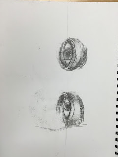
This was my very first attempt in class drawing a face.
I did these two drawings after watching videos in class and learning about the proper way to draw facial features.
This was my face after I had learned about how to draw one correctly.
Opacity


I spent a lot of my time on this piece. I used every bit of class time to finish it and make it look good. I think the way I positioned the marshmallows and chocolate and graham crackers shows a story. I think that the ingredients being placed on a table was a good choice. I used a purple to show the shadows in the marshmallows so I didn't have to use black and for the reflection on the Hershey bar I used a blue color. I tried using colors that I didn't necessarily see in the picture I was drawing. For the two Hershey pieces at the bottom I used a pink color instead of straight brown and I think the colors really bring this together. The shadows on the table made by the marshmallows and the pieces of Hershey chocolate really help the drawing look more realistic. The dark color I used in the background helped make the table and ingredients stand out.
I used prisma color and if I hadn't used them before I don't think this drawing would have turned out how it did. When you use prisma you can't just go at it. You have to layer colors and take your time. I think the fact that I didn't rush and I used all my time instead of procrastinating made this piece a success. A problem I had while drawing was making the marshmallows inside the bag, LOOK like they were inside the bag. I ended up using a gray color for the marshmallows inside to show the bag was see through. It was also difficult trying to draw the proportions right, but I think I did a pretty good job.
Subscribe to:
Posts (Atom)


